
Interior designers are noticing a shift in client preferences—from sunlit terracotta to muted emeralds, and even periwinkle combined with chocolate brown.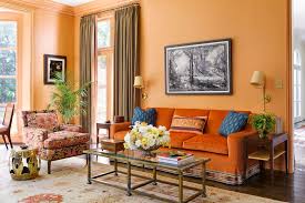
While paint brands have already highlighted key shades—Behr’s Hidden Gem (smoky jade), Valspar’s Warm Eucalyptus (soft muted green), and Benjamin Moore’s Silhouette (rich espresso with charcoal undertones)—designer insights reveal even more about what homeowners are asking for. Clients are seeking warmer, deeper, and more adventurous colors. Walnut is replacing white oak, merlot is overtaking greige, and unconventional color combinations are producing striking, memorable spaces.
Here’s a breakdown of what’s trending for 2026.
Warmer, Richer Neutrals
Neutrals remain popular but are trending warmer and more layered. Stephanie Hunt, founder of The Flairhunter, explains, “Clients are favoring richer wood stains and moving away from ‘millennial grey.’ They want finishes that feel inviting rather than austere.”
Emily Lindemann of Ruggles Lindemann Bell notes that browns, rusts, and greens are particularly in demand.
Jen Baxter of Baxter Hill Interiors predicts earthy, organic mid-tones like chalky rose, smoky blue, tobacco brown, dusty olive, sunbaked terracotta, and soft charcoal—colors that feel timeless and naturally integrated into homes. Matthias Silverton of The Snug Co. sees earth tones with texture, such as olive green, mustard yellow, and burnt orange combinations. In short, shades inspired by nature and sunlight are in.
Dusty Jewel Tones
Jewel tones are still trending, but in dustier, vintage-inspired shades. Hunt says, “Think of an emerald ring rediscovered after decades in a jewelry box.”
Emily LaMarque, principal of Emily LaMarque Design Studio, reports clients are drawn to deep, saturated hues: Prussian blue, deep sapphire, muted emeralds, earthy greens, and soft cranberry reds. Manuella Moreira adds that these jewel tones provide depth and sophistication—deep blues and greens create calm, while layered amethyst or similar shades introduce personality.
Unexpected Color Pairings
The boldest trend for 2026 is unexpected, high-contrast color combinations. Sarah and Rebecca Goesling of Goesling Group explain, “Colors are less about classic appeal and more about creating emotion and memory.”
They note bright, energetic shades like teal, cobalt, periwinkle, and chartreuse paired with grounded, neutral tones for balance. Examples include:
Satin periwinkle with velvet chocolate
High-gloss chartreuse with matte baby blue
Matte tangerine with metallic moss
Hunt also highlights “color capping,” where a single color is used in varying shades across a room—like a ceiling and headboard in one color, but lighter or darker, with chairs, bedding, and accessories in complementary tones.
The 2026 color landscape emphasizes warmth, depth, and daring creativity, blending natural, earthy tones with jewel-inspired pops for dynamic and inviting interiors.